

The Meteor Company ®
As LATAM's financial landscape evolves rapidly, the arrival of Meteor, a new cryptocurrency exchange, signifies a significant growth opportunity for the region's uprising crypto market.
Meteor brings advanced technology and extensive experience to empower latin traders and investors. By providing a user-friendly platform, educational resources and financial tools, Meteor aims to democratize access to cryptocurrency investment, enabling common people to invest on launchpad, save money, and earn in the rapidly expanding realm of blockchain and cryptocurrencies.
Client: Meteor Exchange
Strategy: NKSN Projects
Art Direction: Tata Portal
Strategy: NKSN Projects
Art Direction: Tata Portal
Meteor brings advanced technology and extensive experience to empower latin traders and investors. By providing a user-friendly platform, educational resources and financial tools, Meteor aims to democratize access to cryptocurrency investment, enabling common people to invest on launchpad, save money, and earn in the rapidly expanding realm of blockchain and cryptocurrencies.

The challenge: Meteor approached us with only a logo for their exchange project, seeking to establish a comprehensive visual identity that would effectively communicate their brand values and resonate with their target audience. Drawing on our expertise as a design studio, we embarked on a collaborative process to develop a cohesive visual system that would extend beyond the logo to encompass all aspects of their project.

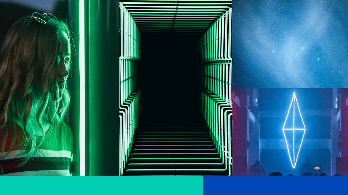
Creating a branding moodboard involves a delicate dance between visual elements, conceptual ideas, and the essence of the brand itself. Each component serves as a building block, contributing to a cohesive and evocative representation of the brand's identity. In this scenario, the inspiration process for the moodboard draws from a diverse array of sources, blending cosmic imagery with elements of technology and human interaction.
The inclusion of space and stars conveys a sense of vastness and possibility, symbolizing the expansive reach and potential of the brand. The notion of "noise" within this context suggests a dynamic and ever-changing environment, reflective of the fast-paced nature of modern business and technology.
The presence of an astronaut amidst the stars serves as a metaphor for humanity's exploration and advancement, highlighting the brand's connection to people and their aspirations. Meanwhile, the use of long-exposure techniques to capture both the streaking motion of people and the blurred trails of stars adds a sense of movement and energy to the composition, reinforcing the idea of progress and evolution. Overall, the moodboard offers a compelling visual narrative that captures the essence of the brand, inviting viewers to embark on a journey of discovery and possibility.
The presence of an astronaut amidst the stars serves as a metaphor for humanity's exploration and advancement, highlighting the brand's connection to people and their aspirations. Meanwhile, the use of long-exposure techniques to capture both the streaking motion of people and the blurred trails of stars adds a sense of movement and energy to the composition, reinforcing the idea of progress and evolution. Overall, the moodboard offers a compelling visual narrative that captures the essence of the brand, inviting viewers to embark on a journey of discovery and possibility.
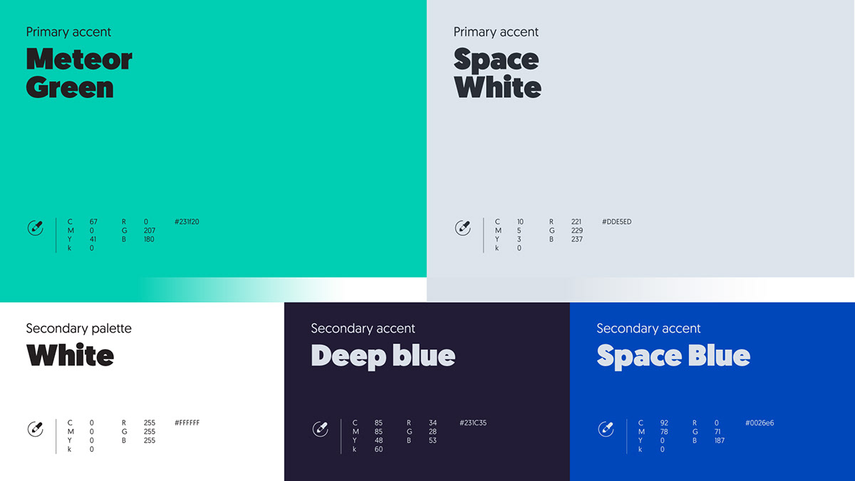
The use of blue and green hues was strategically chosen to evoke a sense of space exploration and cosmic wonder. Blue represents trust, stability, and technology, reflecting the reliability of The Meteor Company's services in the web3 exchange landscape. Green, on the other hand, symbolizes growth, innovation, and sustainability, aligning with the company's vision of fostering a thriving ecosystem in the digital asset space.